menu

This interface had to balance very different stakeholders and their objectives: the patient-sick kids trying to manage chemotherapy side effects, the clinicians- trying to ascertain if they need to adjust treatments during short appointments, researchers that need to process large meta-data sets to inform their recommendations overall.
This project's potential was already defined by a robust set of features and clear goals, but it was trapped in an underperforming and inaccessible layout.
My role was to architect the UI systems and visual language necessary to bring that potential to the surface. By establishing a cohesive design system rooted in their thematic identity, I transformed a collection of high-concept features into an intuitive, accessible, and functional experience.
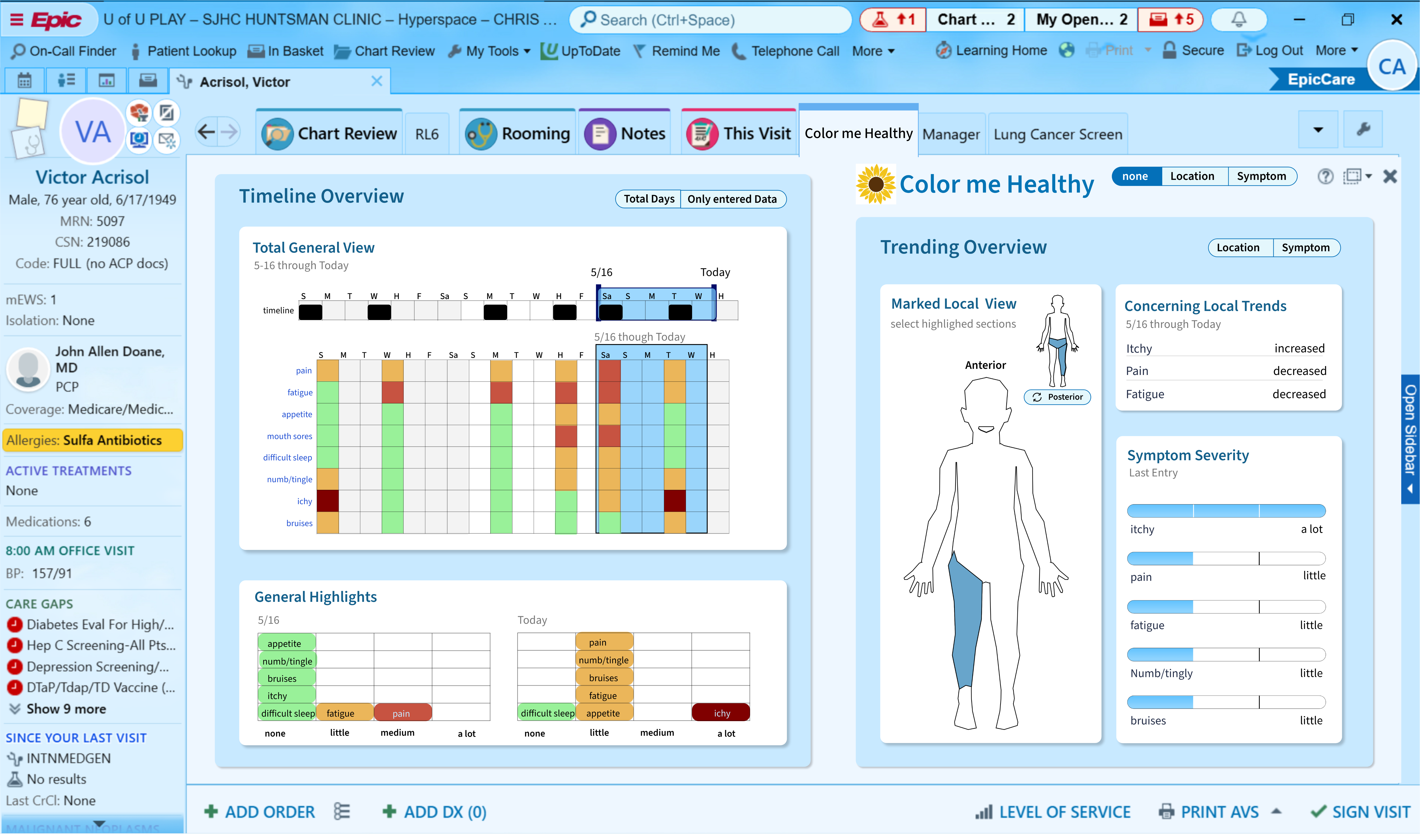
My process for these UI systems was to start with the end-user goals, like fostering a growth mindset, encouraging non-linear exploration, and building community, and work backward.
Each element was not an isolated component, but a deliberate design choice engineered to guide users toward the specific behavioral outcomes the application was built to achieve.
.png)
.png)
I started off with 3 directions for the story categories. Left was closets to their original design if they wanted to keep that direction, middle more visual and modern, right minimal for high dense info. This story structure was important to the client so I made the UI show that with hierarchy and the UX logic flow to and from major story beats.
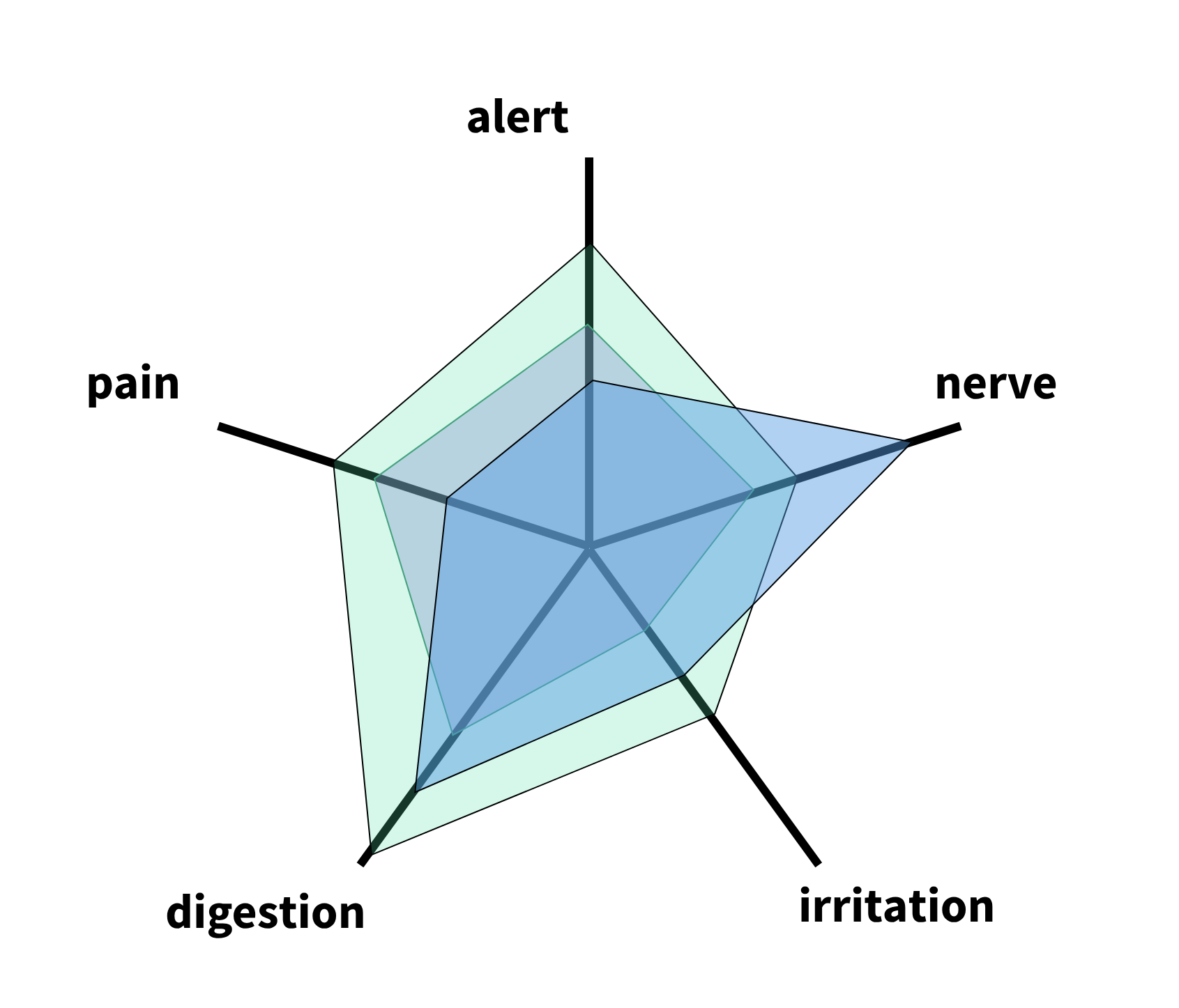
The most important problem to solve for this project was making sure the data was easy to read accurately at low and high density scales. I started by playing with different shapes to see what kind of patterns the users were reading most accurately on instinct. This is the kind of mind set they would need to read the graphs with higher risk of alarm fatigue.
.png)
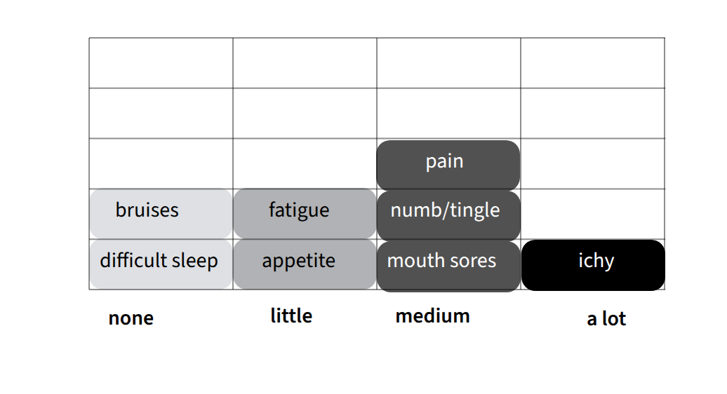
The first failure in their original prototype is that they used poor contrast for red-green colorblind with no text support. So I changed the logic to 'the lighter the color the less sever' and text contest for each entry.
My process for these UI systems was to start with the end-user goals, like fostering a growth mindset, encouraging non-linear exploration, and building community, and work backward.
Each element was not an isolated component, but a deliberate design choice engineered to guide users toward the specific behavioral outcomes the application was built to achieve.
Because the patient can leave felids empty, the bar graph would show their inputs without the illusion of trend lines forming from entered and unentered data
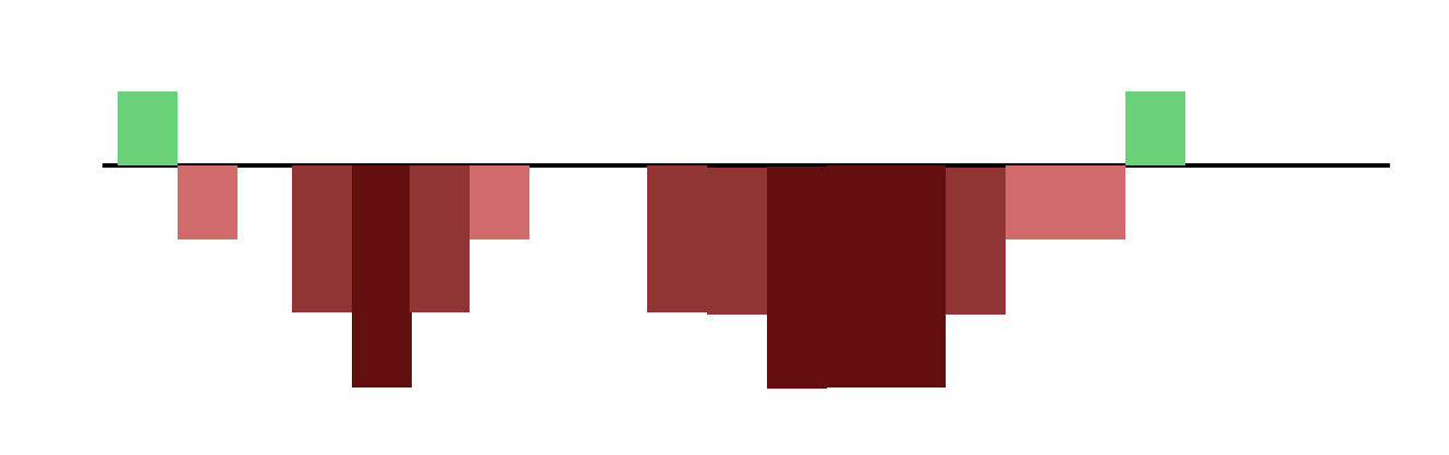
They started with these but the intuition read was too inaccurate for daily use case.
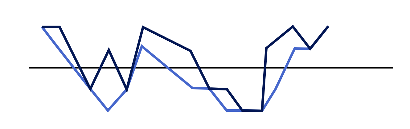
This was requested by users but we had iterate the algorithm that would average the trends without cutting too many details.
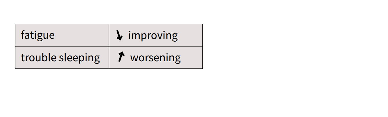
Direct comparison for changes of symptoms reported by patient with visual emphasis on what must be addressed with today's discussion.
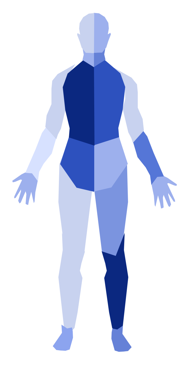
I used this as a baseline in early drafts but it was removed because many clinicians did not have high data literacy with this graphic.