
menu

This app was stuck in development hell for about 7 years, I was brought on to clean-up what they had and polish the design for deployment
Problem: This project had been in development for seven years, trapped in a cycle of feature additions without a cohesive user experience strategy.
My role was to perform a comprehensive audit of the existing build, identify critical usability failures, and polish the design for a successful public deployment. The core features were all present, but they were hidden behind inconsistent UI, poor information architecture, and visual clutter that prevented users from understanding the app's value.


My design audit categorized critical failures by severity, providing a clear roadmap for the redesign. Each finding directly informed a key strategic solution in UX and brand identity.
.png)
.png)
.png)
.png)
.png)
.png)
A case study showcasing a complete redesign of a tedious and inequitable onboarding process for a health app, transforming it into an equitable, low-friction experience that respects the user's time and partnership.
A series of eight screenshots demonstrating the app's original tedious onboarding process: intro, survey, tutorial, and mandatory sign-up. This sequence represents a significant front-end investment required before a user can even try the app to see if it's valuable to them.
The original onboarding suffered from two core failures:


The first redesign draft simplifies the process. It keeps role selection and a simplified spine injury section, then immediately lets the user try the app via an active tutorial instead of passive instructions. Sign-up is made optional and moved out of the onboarding flow, allowing users to experience basic functionality without commitment.
My redesign was guided by core principles of cognitive psychology and modern UX:


The final prototype solves a major UX failure: inequity between partners.
Instead of only the disabled partner filling out a lengthy survey about their body, both partners are treated equally. Both can select disabilities they struggle with. The clinical terms "care partner" and "patient" are replaced with the partners' actual names and the equitable roles of "Supporter" and "Groover," allowing them to define their partnership based on their strengths. The survey only appears when a feature actually needs it.
The final prototype wasn't just a usability fix; it was a strategic alignment with the company's long-term vision to support all types of partnerships, not just spinal injury.


The original app used a single, confusing interface for personal notes, partner chats, and global communities. This created a high risk of users accidentally sharing private medical information publicly.
My redesign introduces distinct visual characters for each communication type, creating clear mental models and preventing critical errors.
The personal journal function was redesigned for clarity and utility. I implemented a vertical layout optimized for mobile scrolling, consolidating the timeline and note-taking features into a single, coherent history.
A key user request was to track how quests affected their mood (a beloved feature from the old system that was previously isolated and disconnected). The new journal integrates mood recording directly alongside the quest's symbol and name.
Critically, it only displays the information the user provides; it removes the frustrating blank template for photos, presenting their data in a pleasant, streamlined way. Furthermore, entries are color-coded by quest type, allowing users to visually scan their history to identify patterns and habits in their well-being at a glance.


The community feature is fundamentally about constructing and maintaining human connection. The partner chat is more than just texting; it's a dedicated space for relationship-building. Partners can give specific feedback on quests and see which ones each other favorited, providing immediate, non-verbal insight into what truly affected their significant other.
The global communities are designed to leverage a built-in advantage: creating a safe place to ask questions that might not get time in a clinical setting. These spaces are moderated by clinicians who recommend the app to their patients, adding a layer of medical oversight. This allows for intervention—guiding users to a hospital or crisis center when necessary—ensuring accountability and keeping people safe when they are most vulnerable. Ultimately, these communities provide a rare and crucial outlet: a place to get advice from others who share the same point-of-view, to vent frustrations in a healthy way, and to process difficult emotions without the risk of lashing out at a partner or turning to self-harm.


Accessibility wasn't a feature in this app; it was the foundation of the experience. Our target audience was a couple navigating the complexities of disability together, striving to maintain their relationship beyond the dynamics of caregiving. If the app itself was inaccessible, if it was confusing, frustrating, or required interpretation, it would become just one more thing that eroded the disabled partners independence and forced the other partner into a caretaker role.
Therefore, our usability had to be flawless. The design needed to be so intuitive, so clear, and so engaging that using the app felt like a fun, shared activity (a highlight of their connection, not a burden). This commitment to radical clarity and multi-modal understanding directly fueled our solutions.

One of the key accessibility challenges was ensuring the interface was usable for individuals with cognitive differences, including those with brain injuries common alongside spinal cord injuries. My solution was a multi-input UI system for core actions.
Each category uses three distinct cues:
This triple-redundancy ensures that if one cognitive pathway is compromised, others are available to successfully communicate the option's purpose. This creates a more robust, forgiving, and inclusive experience for every user, embodying the principle of Universal Design.
While the multi-input system solved for cognitive clarity, the visual interface itself posed significant physical barriers. The original design used low-contrast colors and problematic color pairings that caused eye strain and were illegible for users with low vision or astigmatism.
Our redesign tackled this on two fronts:


Completing the accessibility trifecta, the final overhaul addressed physical accessibility. The original design placed critical navigation buttons at the top of the screen, a difficult reach that requires significant grip strength and precise dexterity. I relocated the entire navigation system to a bottom navigation bar.
This strategic move serves three key purposes:
This change transforms the app from a physically demanding tool into an effortless extension of the user, ensuring that motor impairments are not a barrier to connection and support."
For me, accessibility isn't a separate checklist to be applied at the end of a project. It is the foundational principle upon which all good design is built. ADA and WCAG 2.2 AA guidelines represent the bare minimum legal and technical requirements. My goal is to not just meet these standards, but to far exceed them by designing experiences that are inherently intuitive, flexible, and usable for everyone.
My approach integrates core accessibility principles directly into the architecture of the product:
The designs in this case study aren't just "WCAG compliant"; they are crafted to provide a seamless and superior experience that acknowledges the vast spectrum of how people see, think, and interact with the world around them.
The client's initial direction used a common 'handicap' style: blocky, stick-figure people in solid colors. This directly contradicted their core mission: to avoid infantilizing users and to see them as people first, not their disabilities.
I advocated for a more organic, dynamic direction that focused on the universal theme of balance in all relationships (romantic, familial, and platonic). This shift placed their love and connection at the forefront, moving decisively away from clinical terminology and imagery.
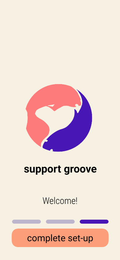
An important theme in their brand was treating both partners as equals by not infantilizing the disabled partner or treating the caretaker partner as a babysitter.
This logo shows that by having the fish with the full tail and fish with the weaker tail both creating the heart, as a metaphor for both partners showing up in the relationship in the ways that they can.
The other metaphor is that with chronic conditions, there is an ebb and flow of good and bad days. So the fish swim with the currents and adjust as needed to restore balance when they can like yin/yang.


.png)

To further distance the brand from a sterile, clinical feel, I created all UI assets by hand. This intentional imperfection provides an organic, playful quality that reinforces the app's human-centric purpose.
Each of the seven theme category icons contains a hidden heart and features a darker, more solid body for consistent visual weight and better contrast. This small, discoverable detail reinforces the core message of love and connection in every activity.


The navigation system continues the brand's fun, nautical theme with custom icons, creating a cohesive and immersive world for the users to explore together.


Throughout the branding process, I presented the client with a range of directions, from more conservative to openly playful.
At every decision point, from color samples to shape language, they consistently gravitated toward the option that was the most fun, bright, and full of whimsy. This unanimous and enthusiastic choice validated our strategy to move decisively away from clinical imagery and toward a brand that celebrates joy and connection.
The result is a cohesive identity system of playful icons, a vibrant palette of pink, mint, and orange, and organic shapes that together create an experience that feels less like a medical tool and more like a shared adventure.
.png)


Building the high-fidelity prototype allowed us to see our solutions interact as a whole system, revealing new insights and defining what to test with users next.
A key insight was shifting from simply stating a change occurred to explaining its meaning and giving the user control.

![Redesigned connection screen: Clearly states "You just linked with [User Name]" and displays their avatar and self-selected tags, providing immediate personal confirmation.](https://cdn.prod.website-files.com/67009f2f423ccdeef1cf91ac/68c5929d59cd3644fa9a8638_linking4.png)

We reinforced that all engagement is opt-in, transforming obligation into agency.


The most significant outcome was a complete renewal of the team's belief in their project.
Next Steps: The prototype is now ready for formal user testing, focusing on the new onboarding flow, the clarity of the quest categories, and the overall usability of the partner connection features.
.png)