Software Suite Design

This is a large-scale, ongoing project where I am guiding the app's development toward a more mature UI/UX standard. My work encompasses a complete overhaul of the brand identity and accessibility foundation

Main Goal: preparing these core features for a live user trial this September.

Disciplines
UX to improve the general user experience
UI custom made assets
Brand Strategy guidance to unify their suite
Deliverables
Full design Audit with improvements recommendations
user flows and prototypes
custom artwork icons and symbols, and app website
recommendations for next steps with feature development
Timeline
August  2025 - ONGOING
Process
A user-first process that prioritizes accessibility, using rapid prototyping and iteration to build intuitive, equitable experiences.
Why they wanted a designer

UX integration

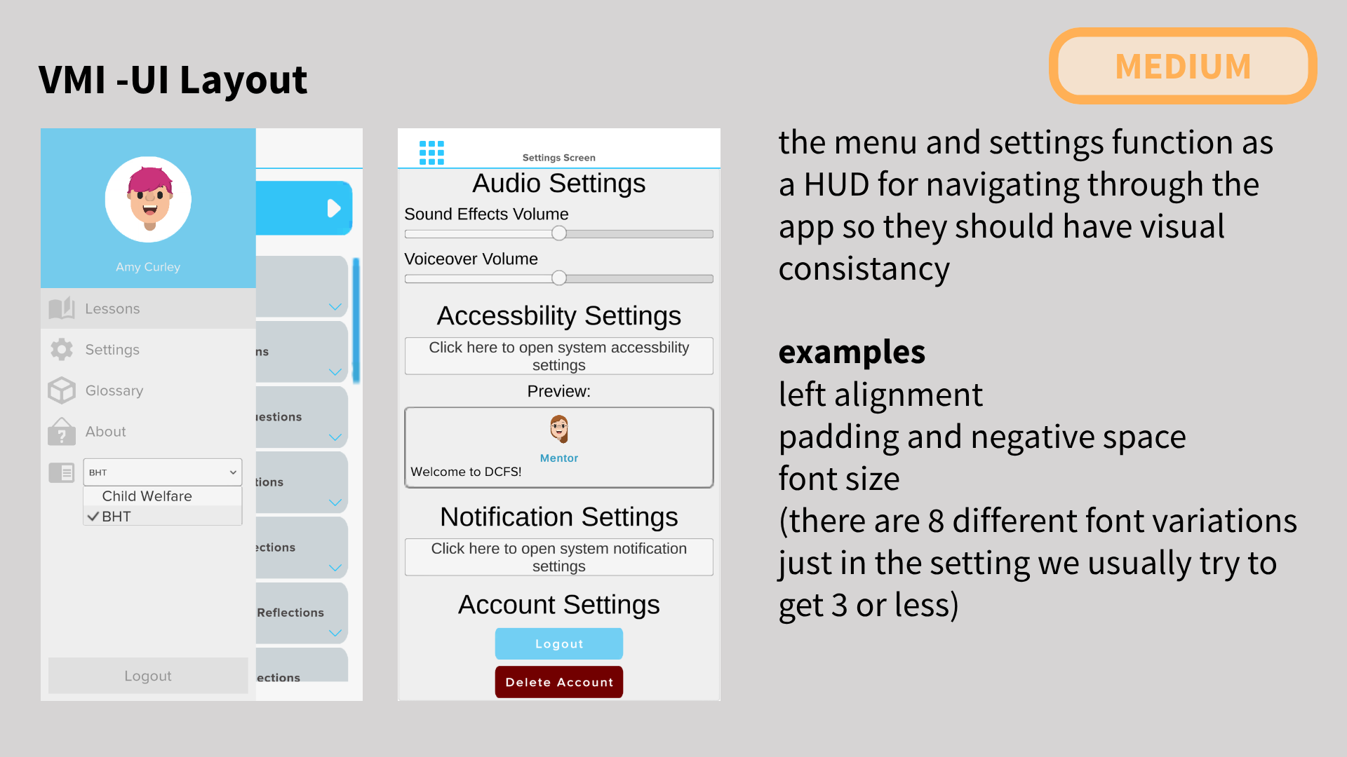
This project's potential was already defined by a robust set of features and clear goals, but it was trapped in an underperforming and inaccessible layout.

My role was to architect the UI systems and visual language necessary to bring that potential to the surface. By establishing a cohesive design system rooted in their thematic identity, I transformed a collection of high-concept features into an intuitive, accessible, and functional experience—ensuring the product finally worked the way it was always intended to.

Original skill navigation: A linear, numbered list of skills. Each skill shows a pie chart representing completion, but with only two states (0% or 100%), making progress tracking overly simplistic and binary.Original mentor chat screen: A conversation with the mentor character. The design has low color contrast and a cluttered layout, making the text difficult to visually process and read.The original skill interface: a simple numerical percentage score, providing limited feedback after a lesson.
The original leaderboard: titled "VMI Scoreboard," it isolates the user's rank at the top and requires awkward horizontal scrolling for long rows of unprioritized stats.
Original exit confirmation pop-up: Features low-contrast white text on a blue background. The "Continue" and "Go Back" buttons are green and red with similar lightness, causing a colorblind accessibility failure.Original settings menu: A densely packed list of options with minimal padding and no visual hierarchy, creating a cramped, stressful, and difficult-to-scan user interface.
Discovery

Strategic Audit: From Diagnosis to Solution

My design audit served as a strategic blueprint, categorizing issues by severity to provide a clear roadmap for the VMI software suite redesign.

Audit slide rated High Severity: "VMI Contrast." Highlights the exit window and main menu using light blue backgrounds with white text, demonstrating a critical failure to meet minimum color contrast ratios.Audit slide rated Medium Severity: "VMI UI Layout." Points out that the side menu and settings use different, inconsistent layouts, violating the principle of visual consistency for predictable user processing.Audit slide rated Medium Severity: "VMI UX Progress Scaling." Critiques the progress pie chart, showing that a short intro section and a long, complex skill are weighted equally, making completion percentages misleading and uninformative.Audit slide rated Medium Severity: "VMI Inconsistent Feedback." Shows that multiple-choice questions receive extensive feedback, while more effortful typed answers receive none, creating an unfair and demotivating user experience.Audit slide rated Medium Severity: "VMI UI Hierarchy." Demonstrates that the text bubble's shape draws more attention than the text inside it, recommending the visual design prioritize the content's importance over its container.Audit slide rated Low Severity: "VMI UX Cognitive Load." Shows a block of dense, unbroken text in a skill description, recommending the use of spacing and chunking—like in comic books—to reduce cognitive load and improve processing ease.

Design Audit Findings

Catastrophic Failures (High Impact)

  • Finding: Critical color contrast ratios (< 2.0) violated WCAG guidelines and destroyed text legibility across core components like pop-ups and menus.
  • UX Solution: I implemented a strict, AA-compliant color palette and established a universal contrast-checking protocol for all future UI components.
  • Brand Solution: The new, accessible color system became a core brand asset, replacing a visually stressful experience with one that feels professional, trustworthy, and inclusive by default.

Structural Failures (Medium Impact)

  • Finding: Inconsistent UI layouts, misleading progress metrics, and illogical feedback systems eroded user trust and created a chaotic experience.
  • UX Solution: I standardized layout patterns, replaced unweighted progress pies with meaningful milestones, and designed a consistent feedback framework that rewards user effort equitably.
  • Brand Solution: This introduced a new brand value
  • Clarity. Consistent interactions build user confidence, making the brand feel reliable and competent.

Polishing Enhancements (Low Impact)

  • Finding: Dense information presentation and poor content hierarchy created unnecessary cognitive load, slowing down comprehension.
  • UX/Brand Solution: I established a clear typographic scale and content chunking principles. This refined the brand's voice to be more direct and digestible, respecting the user's time and mental energy.
UX design

UI systems

My process for these UI systems was to start with the end-user goals, like fostering a growth mindset, encouraging non-linear exploration, and building community, and work backward.

Each element was not an isolated component, but a deliberate design choice engineered to guide users toward the specific behavioral outcomes the application was built to achieve.

Achievements

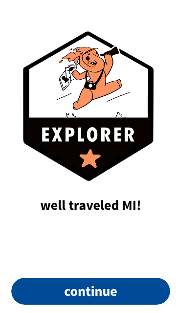
The achievement badge system is directly mapped to the psychological model of skill acquisition, from Unconscious Incompetence to Unconscious Competence. Each stage is personified by Mazzy's growth:

  • Junior Ranger (Unconscious Incompetence): The learner begins, unaware of the skills ahead.
  • Adventurer (Conscious Incompetence): The learner engages, now aware of the challenges and actively acquiring tools.
  • Summit (Conscious Competence): The learner applies skills successfully through deliberate practice.
  • Mastery (Unconscious Competence): The learner achieves fluency, applying the skill effortlessly and intuitively.

This visual progression transforms abstract learning stages into a tangible, rewarding journey, using gamification to motivate students and make their growth feel visible and celebrated.

A four-stage achievement badge progression titled 'Adventurer Skill Progression.' From left to right: 1. Baby Mazzy in a junior ranger hat for the 'Unconscious Incompetence' stage. 2. Teen Mazzy running with tools for 'Conscious Incompetence.' 3. Adult Mazzy reaching a summit for 'Conscious Competence.' 4. Enlightened, floating Mazzy for the 'Unconscious Competence' mastery stage.

Fostering a Growth Mindset

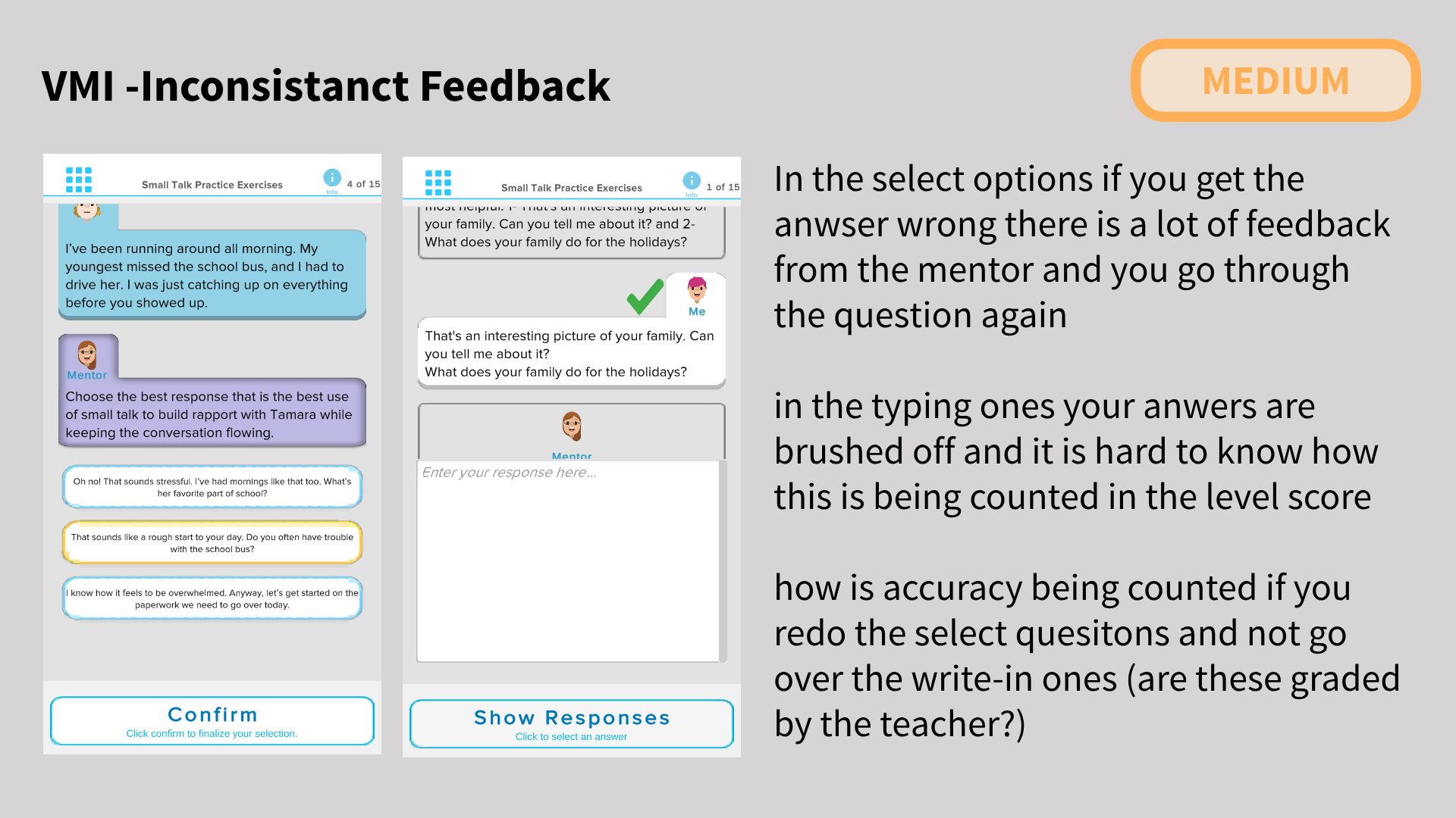
The implementation shifts the focus from a fixed score to actionable, multi-faceted feedback. The original design showed only a percentage, which can lead users to fixate on a number rather than their learning journey.

My redesign replaces this with the visual reward of the badge itself and complementary data like progress blocks. This provides more usable, encouraging feedback after a lesson, celebrating concrete milestones and effort. This approach is designed to sustain engagement by promoting a growth mindset, where the focus is on development and mastery, rather than a fixed mindset obsessed with a single, often discouraging, number.

The original skill interface: a simple numerical percentage score, providing limited feedback after a lesson.A redesigned skill interface sketch. It replaces the percentage with the earned badge and its descriptive title, focusing on milestone achievement.An alternative redesign variation. It shows a smaller badge alongside visual progress blocks for exercises completed and a score, providing multiple forms of feedback.

Leaderboard

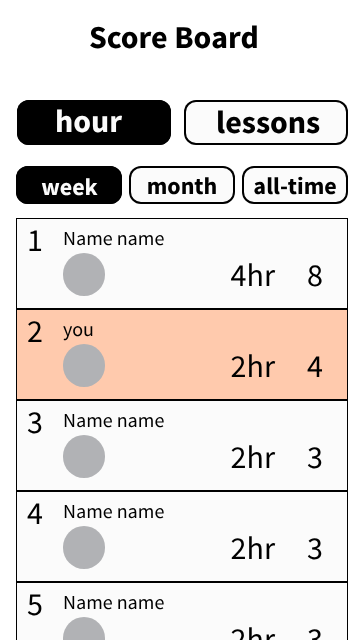
The original leaderboard had the basic features they wanted, but no UI design with horizontal scrolling and no clear hierarchy. Following a UX consultation, the client expressed a desire for the friendly, community-driven competition seen in apps like ski trackers and the UX feelings they wanted to evoke.

The redesigns introduce a clear, two-tiered filter system (stat type and timeframe) to help users understand the data. By focusing on one metric at a time—whether in a button-based or swipe interface. The new design allows a cohort to interact healthily, see what peers are prioritizing, and discover which learning approaches lead to success, turning their starting UI into a tool for community engagement.

The original leaderboard: titled "VMI Scoreboard," it isolates the user's rank at the top and requires awkward horizontal scrolling for long rows of unprioritized stats.
First redesign: A clear hierarchy with filters for stat type (hours/lessons) and timeframe (week/month/all-time). Rankings display names above stats, with the user highlighted in a distinct orange.Final redesign: Replaces buttons with a swipeable carousel widget to focus on one stat at a time. The user highlight is now a clear blue, and the title is simplified to "Scoreboard."

Story Quest Layout

The Story Quest is designed as an instructional amalgam, weaving together diverse exercise types: chatbot conversations and skills practice to applied story chapters and video tutorials. The core design challenge was preventing a natural tendency toward linear, syllabus-style completion.

To foster a more dynamic and structured study habit, we implemented a game-like skill tree navigation. This system encourages users to jump between topics, repeat exercises for mastery, and try new challenges for fun, creating a playful yet balanced ecosystem that intrinsically motivates exploration across all exercise modalities.

User Flow

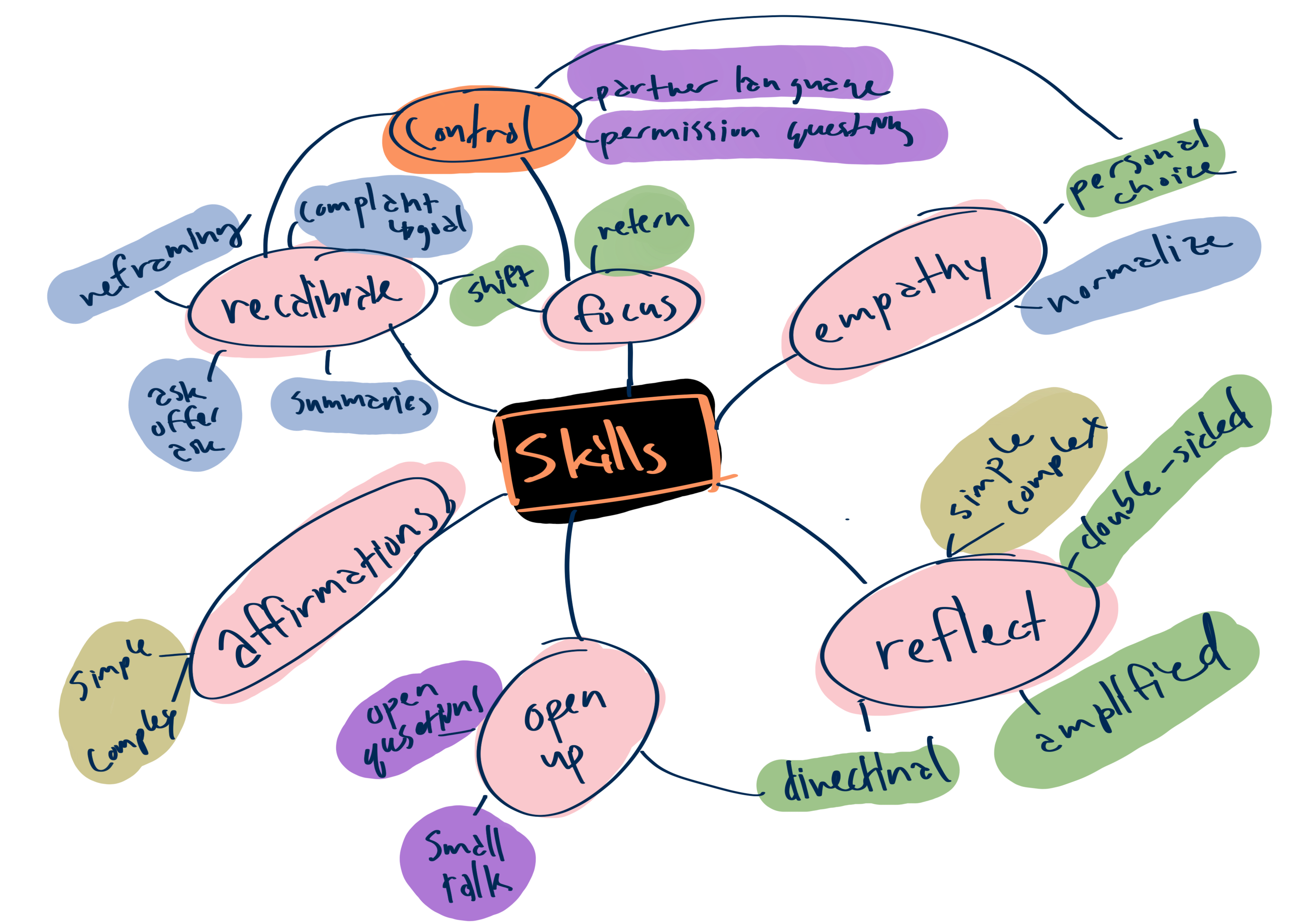
The original skill list was a major point of cognitive overload, presenting over 20 skills of varying intensity and length in a single, implicitly linear sequence. This directly contradicted the client's goal of allowing non-linear, self-directed exploration where users could review old sections while discovering new ones.

The solution was a complete information architecture overhaul. I developed a user flow organized around thematic clusters—such as Recalibrate, Empathy, Reflect, Open Up, and Affirmations—keeping the number of groups under seven to align with short-term memory limits. This structure empowers users to focus on what they need most in the moment (e.g., practicing how to get a client to "Open Up") without being forced down a rigid, predefined path, transforming an overwhelming list into a manageable toolkit for professional growth.

A hand-drawn mind map reorganizing over 20 social work skills. The skills are grouped into thematic clusters like "Recalibrate," "Empathy," "Reflect," "Open Up," and "Affirmations" to reduce cognitive load and allow non-linear, interest-based navigation.

Navigation UI

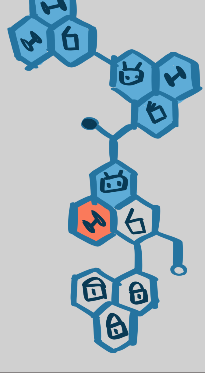
This exploration tested two distinct layout strategies for the story quest navigation. The first used a high-context culture approach: dense clusters of small hexagons that provide maximum information upfront, favoring explicit structure and individual choice. The second used a low-context culture approach: larger, artful shapes with ample breathing room, suggesting a path through implication and atmosphere.

The testing revealed that our audience of American medical students, while operating in the high-context environment of Electronic Health Records (EHRs) professionally, strongly preferred the low-context, Western-style UI for their learning. In this context, they wanted clear, guided hierarchy and explicit information architecture, demonstrating that user expectations for structure can dominate even when their professional training involves navigating more implicit systems.

A story quest navigation map using a low-context design strategy. It features small, numerous hexagons grouped into clear clusters, providing a detailed, structured overview of many paths at once.A story quest navigation map using a high-context design strategy. It uses larger, more playful shapes with artistic accents and balanced negative space, creating a breathable, less structured journey that implies flow over explicit instruction.
brand strategy

The Brand Identity

The core brand strategy was to fundamentally differentiate the suite from the sterile, lifeless aesthetic typical of clinical and educational software. The goal was to make students feel the care and effort invested in supporting their journey.

Furthermore, with the integration of gamification elements to boost engagement, the branding needed to feel modern, approachable, and fun. This was essential for fostering a growth mindset. A learning state that is open, curious, and resilient, rather than pressured or monotonous. Our visual system, built on the cohesive but dynamic hexagon framework and a fresh color palette, was designed to embody this philosophy: structured and professional, yet inherently human, energetic, and supportive.

Logo Exploration

The client's existing software suite suffered from a complete lack of visual cohesion; each app had a different logo style, color, and shape language, making them feel unrelated.

My strategic recommendation was to establish a unified design system to support their plans for future growth. I introduced a consistent hexagon shape and a restricted palette of dark/medium blue and white across all concepts. This created an immediate familial relationship between the master suite logo and the individual application icons, ensuring that both current and future apps would be recognized as part of the same professional ecosystem.

Original logo for the VSWT software suite: a white circle containing the letters "VSWT" with an abstract, unrecognizable shape meant to be four hands forming a circle.Original logo for the VHS app: a black square with a very angular, negative-space house shape and the letters "VHS," using a completely different style.Original logo for a third app: a bright blue app icon with angular, rectangular text bubbles, again following a different visual language.

The Original Logos

Proposed master suite logo: A hexagon shape containing a more recognizable abstract of four hands in dark and medium blue. This establishes the hexagon and blue/white color scheme as the suite's foundation.Proposed VHS app logo: Uses the dark blue background and rectangular shape language to form a white house within a hexagon, creating a clear relationship to the master suite brand.Proposed chat app logo: A medium blue hexagon background with two white chat bubbles, consistently applying the suite's shape and color language to a new function.

My Concept Logos

The base white hexagon shape that forms the foundation of the new design system.
A diagram showing how the house icon is constructed from the hexagon. The roof angle is defined by the hexagon's 120-degree angle.A diagram showing how the chat bubble icon is constructed from the hexagon. The body uses the 120-degree angle, and the speech pointer is derived from a 60-degree angle.

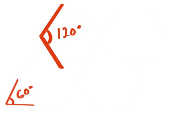
The consistency is engineered into the system's geometry. A hexagon's internal angles are 120 degrees. When subdivided into six equilateral triangles, each triangle has 60-degree angles. This is the foundation of our iconography: the house icon's roof uses the hexagon's 120-degree angle, while the chat bubble's speech pointer is derived from the 60-degree angle of the internal triangles. This mathematical relationship ensures every element is intrinsically connected, building a unified and scalable visual language from the ground up.

Mascot

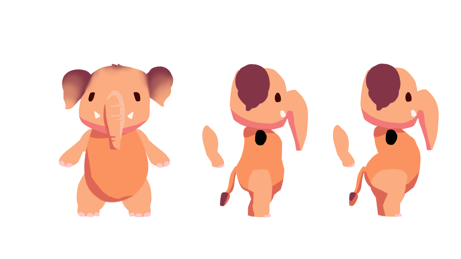
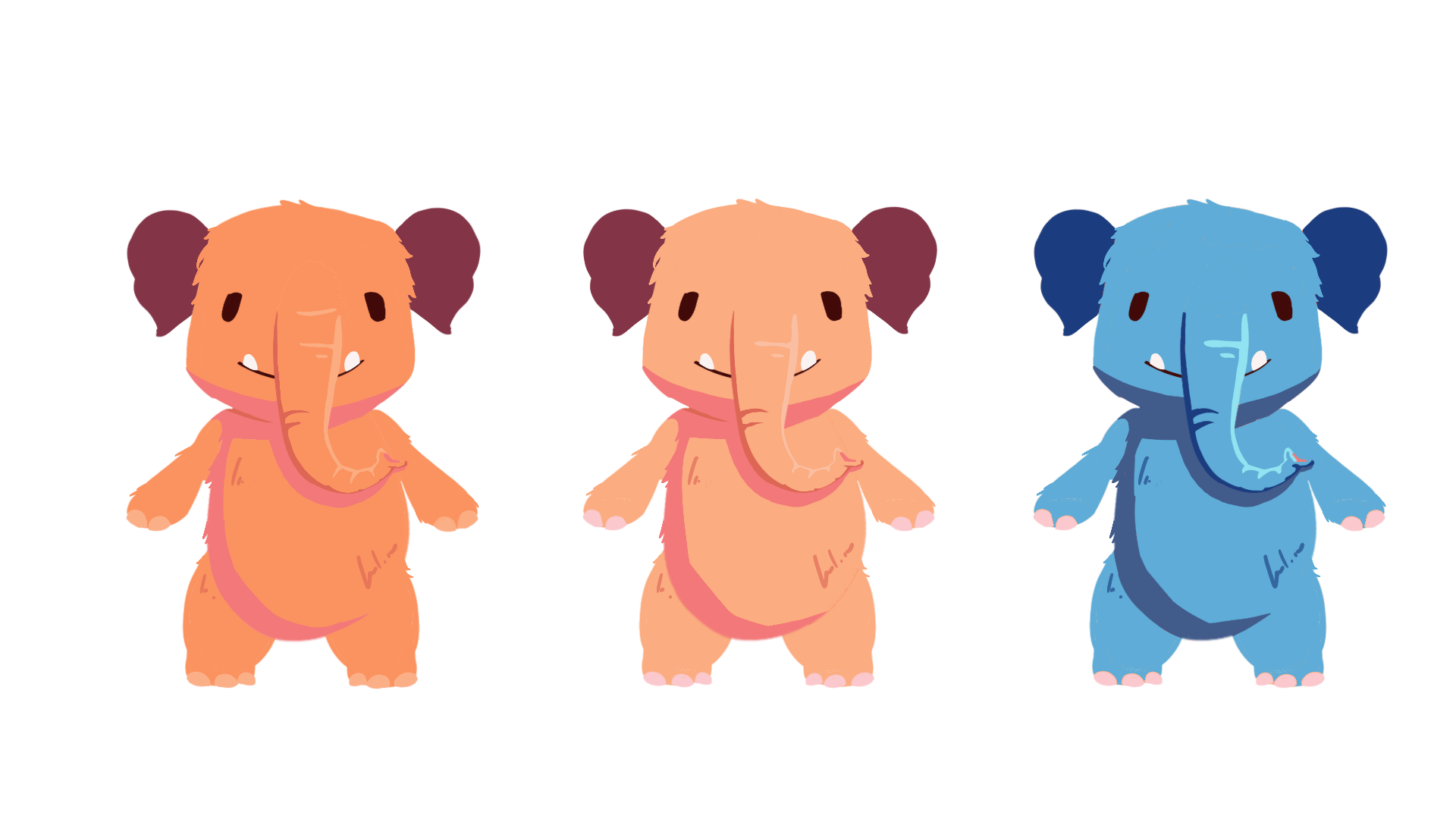
The visual development of the mascot, 'Mazzy the Mastodon,' focused on creating a cute, memorable mentor. While the client was set on an elephant for its symbolism of strong social networks, I deepened the local connection by looking to Utah's prehistoric past. Mastodons, ice-age relatives of mammoths, actually roamed the region. They provided a perfect foundation: their smaller ears and potential for a fluffy coat (due to the cold climate) made them inherently cuter.

The exploration involved defining key traits—nose length, body proportions, and color—to find the right balance of friendly and capable. Adding playful elements like sego lily flower pigtails and a cowboy outfit helped establish a unique personality that feels both nurturing and distinctly Utah.

Early mascot sketch: A front view of a light orange mastodon with a very short, small nose/trunk.Mascot exploration: A medium-dark orange mastodon head with a longer nose/trunk.Mascot exploration: A darker, reddish mastodon with a very wide nose, longer legs, and flowers on its head.Mascot exploration: A light pink, very round mastodon with a small nose and stubby legs.
Two sketches of the evolving Mazzy mascot in orange with a small nose. One shows a side view with a lean belly, the other a curvier, rounder body.Character development: Mazzy the mastodon with flower "pigtails" on her ears and dark hair. A separate sketch shows her in a cowboy hat with a scar, giving her a playful, rugged Utah personality.
A sheet of sketches exploring different head silhouettes and nose-to-head shape ratios for the mastodon mascot.Final character exploration: A fluffy Mazzy with a long nose/trunk, shown in three color variations: medium orange, light orange, and an experimental medium blue.

Bringing Mazzy to Life

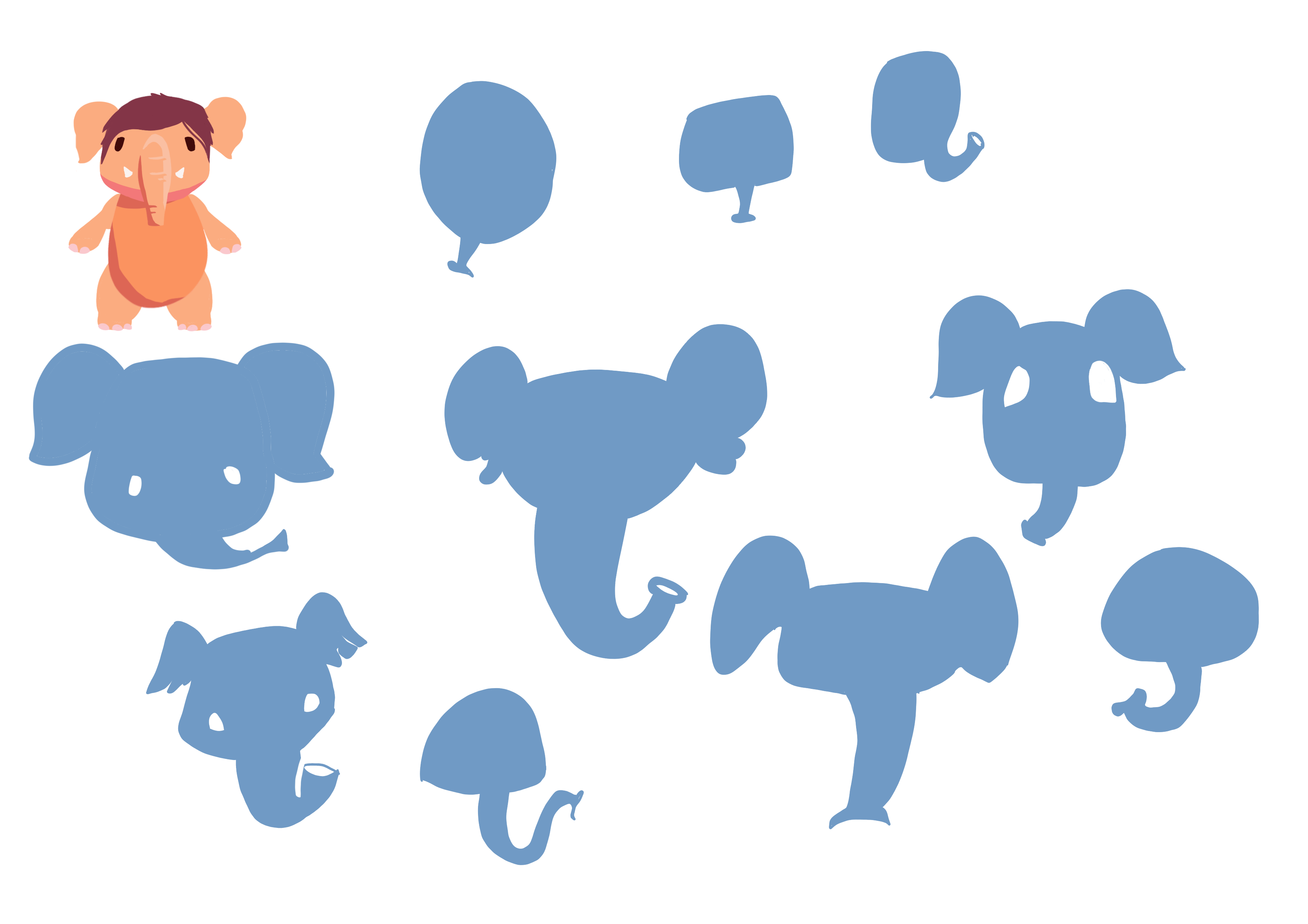
For Mazzy to be an effective digital mentor, she needed to react to user input in a fun, emotionally clear, and immediate way. Because she is a stylized character, her emotions had to be more exaggerated to be read instantly from her core shapes.

This involved creating a library of expressive poses, from a sad droop of the trunk to an angry flare of the ears, ensuring she can provide nuanced, non-verbal feedback that supports the learner's journey without relying on text. These reactions are key to building a relatable and encouraging gamified experience.

A sheet of sketch studies testing how far to push Mazzy's facial distortions—like very wide eyes or a giant smile—to ensure her stylized emotions are clearly readable from her core shapes.

A key challenge in animating a stylized character like Mazzy is the exaggeration balance. The more a design is simplified and stripped down to basic shapes, the less visual information there is to convey subtle emotion. To compensate, the expressions must be pushed further (bigger eyes, more distorted features, broader gestures). This exaggeration ensures that feelings are read instantly and clearly, even at a small scale, making the character an effective communicator despite its simplified form.

Colored Test: A sad Mazzy with her ears and trunk drooping down low, expressing disappointment.Colored Test: An angry Mazzy with her ears stylized as red flames and her eyes angled sharply in a glare.Colored Test: Mazzy in a facepalm pose, eyes closed with her palm to her face, expressing mild frustration or a "silly me" moment.Colored Test: A shocked Mazzy with her eyes bugging out in different directions and shocked lines on her forehead, expressing utter surprise.Colored Test: A flustered Mazzy with a pink nose and puffed-up cheeks, and her little fists clenched in embarrassment.Colored Test: A thinking Mazzy wearing glasses, holding a teaching pointer stick to her head with her hand on her chin in a classic thinking pose.
Prototype

Results and Next Steps

The prototype is now in user trials, marking the start of a new development cycle. I will help analyze the feedback to prioritize and implement design refinements, ensuring the final product is deeply aligned with user needs.

A key outcome has been the client's renewed excitement and trust. They have expressed strong appreciation for how I contextualize design choices, clearly linking each decision back to the specific problems and concerns they raise. This has empowered them to confidently explore the design process and trust the strategic recommendations provided.