
menu

After being hacked for two consecutive years, resulting in the total loss of several websites, all media, data, and content, the client faced a critical emergency. Their subdomains were recognized as vulnerable targets, and the annual cycle of rebuilding was unsustainable.
The client's frustration was twofold. Technically, they had cycled through every viable web builder, settling on WordPress without enthusiasm, only for it to fail them catastrophically. Strategically, the hacks occurred in the fall (the critical period for student recruitment) leaving them with no functional website and only sparse, incomplete archives from the Wayback Machine.My proposal was a fundamental architectural shift to break the cycle of vulnerability:
This approach transformed their web presence from a recurring liability into a secure, maintainable, and scalable asset.
The primary challenge was that the website needed to visualize an internal system that was, itself, a mess. Critical information was fractured across different roles, creating bureaucratic bottlenecks where assembling a single, complete answer required interrogating multiple people. Furthermore, their reliance on hardcoded, local files like outdated Excel spreadsheets made their most important data inherently unreliable.
Therefore, the most crucial part of discovery was not just designing page layouts, but designing a sustainable information flow. The core goal was to create a clear, maintainable system architecture for the website that could withstand the organization's inherent complexity and be reliably updated long after the project was complete. This process forced a necessary clarification of what the website truly needed to be: a single source of truth, rather than another fractured reflection of their internal chaos.
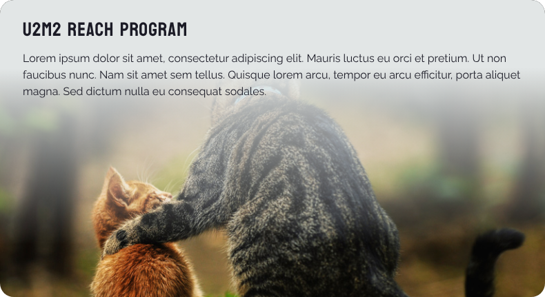
The website needed to serve a complex academic ecosystem, but its structure was unclear. The first critical step was to move beyond vague assumptions and precisely define who we were building for and what they needed to accomplish.

.png)
.png)
.png)
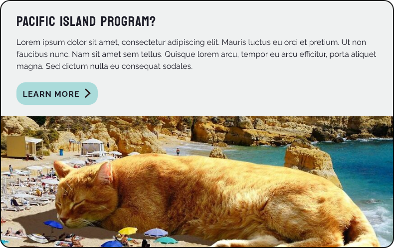
The grad student persona crystallized the needs of a user looking to join a research lab. We broke this down into two core tasks:
Mapping this journey immediately provided clarity. It forced us to answer critical questions: Where does lab information live? Is it easy to find a professor's research? This persona, and the others, became our benchmark. Every design decision could be tested against a simple question: "Does this help the graduate student find a lab?"
This process shifted the project's focus from building a general-purpose site to crafting a targeted tool for specific user goals, establishing a clear, user-centered foundation for the entire architecture.
A common and frustrating experience with large university websites, including the University of Utah's, is the sheer impossibility of finding anything. A well-known local workaround was to bypass the official site entirely and use a search engine like Google. This fundamental user experience failure was deeply embedded in their old website.
I positioned user-centric design as the primary lens for critique and reconstruction. This principle became the non-negotiable foundation for every decision in the information architecture and interface design, ensuring the new site would serve its users, not just its organizational structure.
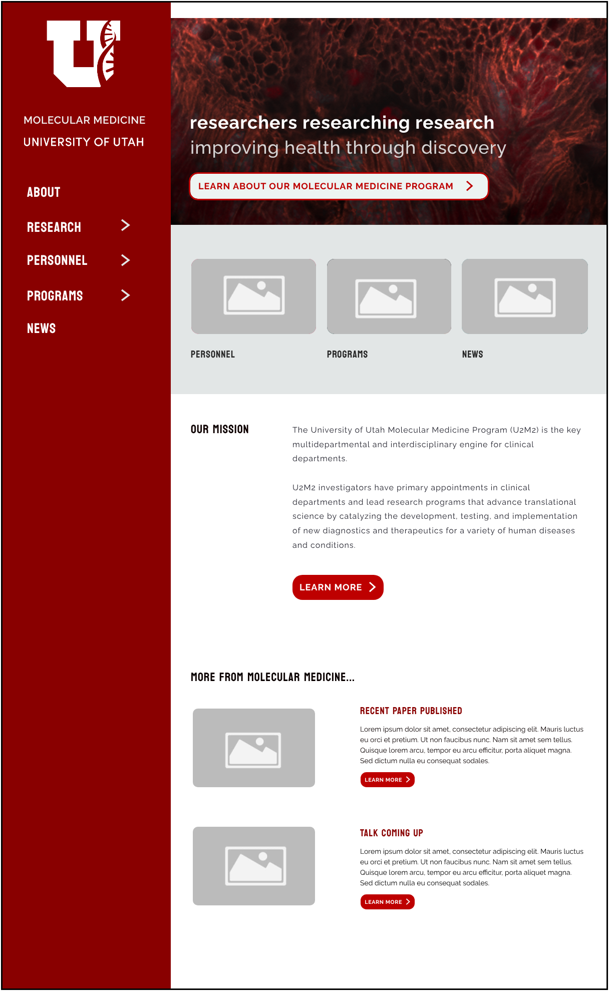
To combat the site's historic unusability, the homepage was designed by leveraging Jakob's Law-the principle that users spend most of their time on other sites, so they expect yours to work the same way.
We implemented a classic, recognizable homepage anatomy. This familiar structure, combined with strategic negative space, allows users to scan the page effortlessly. Crucially, the sections immediately below the fold are tailored to the primary personas, placing the paths to "find a lab" and "research resources" directly in their line of sight, transforming the homepage from a confusing portal into a clear starting point for their most important journeys.
.png)
.png)
The existing website had zero accessibility measures—not even alt text for images. With new ADA standards for federally funded institutions like universities taking effect in 2025, the primary goal was to achieve full compliance and avoid legal risk.
This project involved a ground-up implementation of WCAG 2.2 AA guidelines, systematically integrating alt text, screen reader-friendly ARIA tags, keyboard navigation, and color contrast standards. This work transformed the site from an inaccessible liability into an equitable, inclusive resource that serves all users.
A primary concern was the website's long-term sustainability. The previous admin team found the old system impossible to maintain, creating anxiety that history would repeat itself.
To solve this, the content management system (CMS) was designed with a core focus on admin UX. The interface is intuitive and task-oriented, making it easy for different staff members to pick up where others left off as responsibilities shift. This approach not only ensures the site can be easily maintained but also fosters optimism and confidence in the team, turning the website from a source of stress into a manageable, sustainable asset.
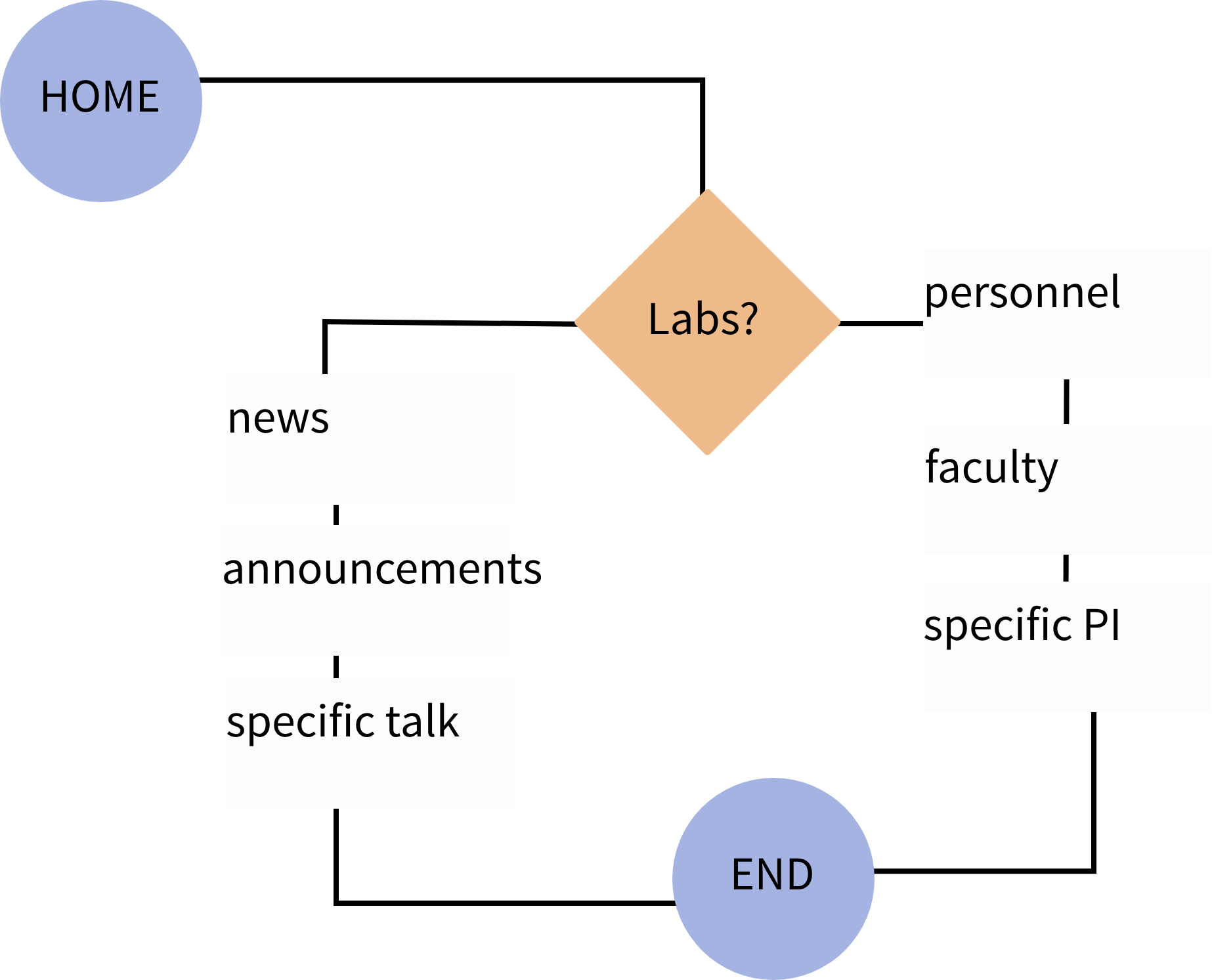
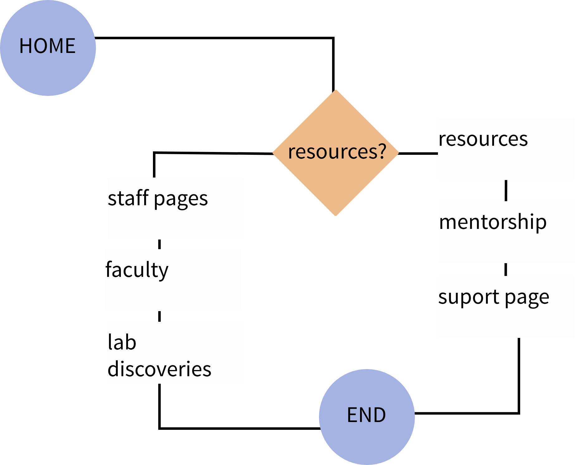
The first critical step was to design the underlying system. I created a complete sitemap to visualize the entire information architecture, serving three vital purposes:
This established a clean, maintainable boundary, preventing the fractured, confusing user journeys that plagued the old site and empowering the team with a clear roadmap for content population.
.png)
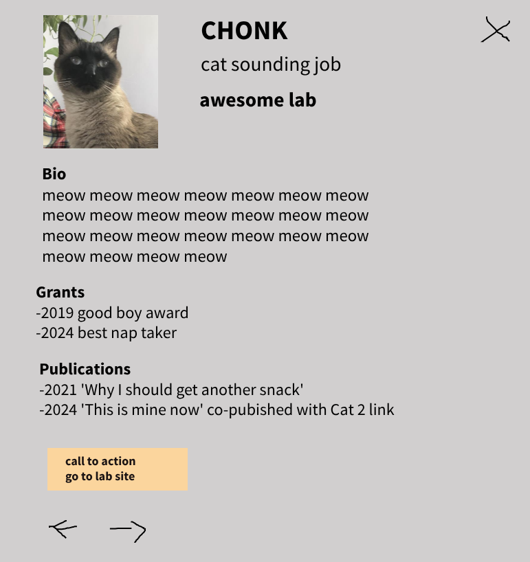
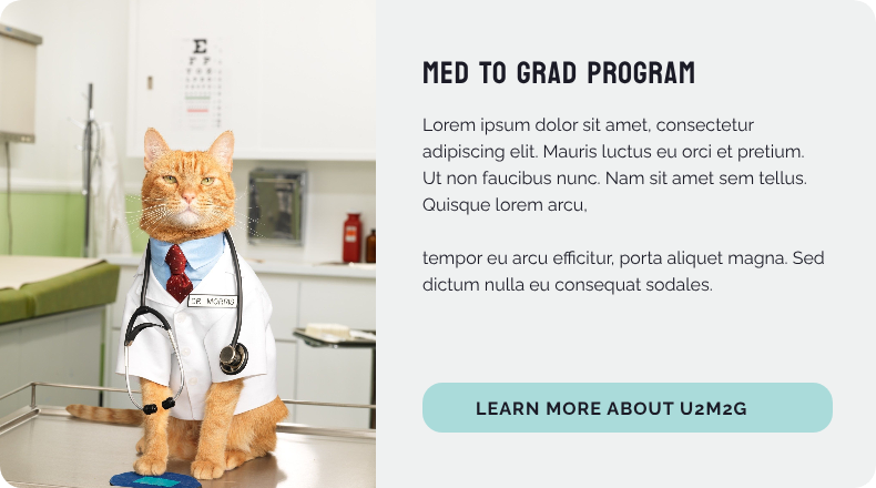
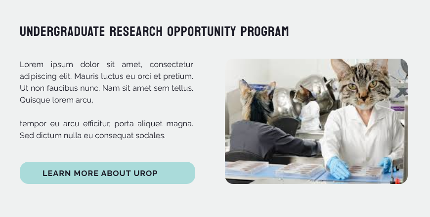
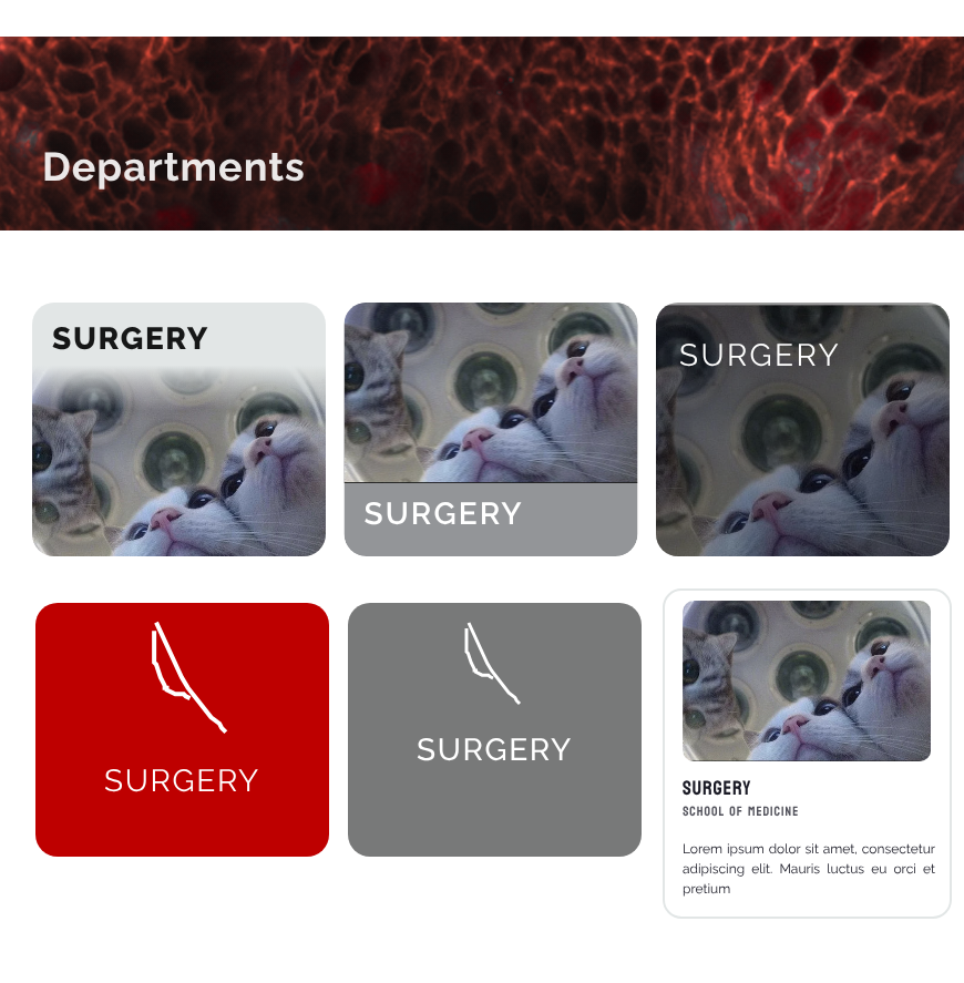
A major hurdle in academic design is stakeholder fixation on placeholder content, which can derail feedback on the underlying structure. To solve this, the CMS wireframes were designed to clearly show how information from different sources, like a central photographer and individual researchers, flows into a unified layout.
Crucially, I used deliberately absurd, cat-themed placeholder content ("Bio: Meow meow meow"). This prevented stakeholders from getting bogged down in factual details and instead prompted more accurate feedback on the template's functionality, user flow, and overall design, ensuring the conversation remained focused on building a robust and flexible system.
.png)
This project required building a complete visual language from the ground up. While the University's brand provided a basic foundation, it had significant gaps in detailed application for a modern web interface.
My role was to extend this system by filling in the blanks with strong, foundational design principles, establishing a clear typographic scale, a cohesive spacing system, and an accessible color palette. The process involved a careful balance of adhering to the core brand, incorporating the client's specific preferences, and ensuring every choice served the ultimate goals of clarity and usability.
This exploration yielded two critical insights that directly shaped the final design direction.
This established a clean, maintainable boundary, preventing the fractured, confusing user journeys that plagued the old site and empowering the team with a clear roadmap for content population.
.png)
The prototype addressed two distinct challenges to get the project back on track:
.png)
We have successfully launched a fully functional prototype that serves as the Minimum Viable Product (MVP). It now features the client's updated text and imagery within a clean, user-friendly format.
Our current focus is on a cycle of continuous polishing and rigorous testing of the underlying maintenance systems to ensure long-term stability and ease of use.
A significant challenge arose when advocating for the user-centric and accessible systems we had established. One stakeholder insisted on changes that directly compromised those core principles. My response was a pragmatic, blunt warning that deviating from the recommendations would break the functionality and accessibility I could guarantee.
This was perceived as inflexibility, highlighting a key learning: communicating design constraints requires as much empathy as the design itself. In retrospect, this resistance is a known psychological reaction to change, pushing too hard can cause backsliding. The experience reinforced that my role isn't just to build the right system, but to gently guide stakeholders through the change, helping them understand that a design, like code, is a tool with specific capabilities and limits, and that trust in the process is essential for achieving the project's original goals for real users.
The project has successfully culminated in a live, fully functional website. The outcome reflects a collaborative balance, incorporating the client's preference for a slender, non-black side navigation and their internally sourced imagery to ensure rights management.
The final layout intentionally mirrors familiar platforms like Canvas, leveraging users' existing mental models for intuitive navigation. This new site is already more functional and robust than its predecessor, with all foundational accessibility standards and security measures securely implemented, finally providing a stable and equitable digital platform for its users.

The immediate next step is to scale this successful model. We will now work to bring the department's various lab and research websites live, applying the same rigorous standards for security, accessibility, and intuitive user experience to create a cohesive and trustworthy digital ecosystem across the entire organization.